CSS Media Query

Full stack developer
Media Query
The Media query in CSS is used to create a responsive web design. It means that the view of a web page differs from system to system based on screen or media types. The breakpoint specifies for what device-width size, the content is just starting to break or deform.
Media queries can be used to check many things:
- width and height of the viewport
- width and height of the device
- Orientation
- Resolution
A media query consist of a media type that can contain one or more expression which can be either true or false. The result of the query is true if the specified media matches the type of device the document is displayed on. If the media query is true then a style sheet is applied.
@media min(screen-size) and max(screen-size){
    /* we can give as many classes and id's in this area to provide styling and styling will apply on provided screen-size only*/
}
Media Types
These are given after the @media which determines the device types. On what types of devices is the CSS will be applied is determined by the media types . There are some mostly used media types those are all, screen , print .
all means the media features will be applied on all the devices it is default type if we do not mention the media type.
@media all  {
    .container{
        /* styles */
    }
}
screen this is used for mobiles , tablets and computer.
@media screen  {
    .container{
        /* styles */
    }
}
print this is used for the printers.
@media print  {
    .container{
        /* styles */
    }
}
Logical operators Apart from the above media types some conditionals are used as only , not , and , , for providing additional information based on the conditions.
@media only screen and (min-width: 600px) {
    /* styles */
}
@media screen, print {
  body {
  }
}
Device Breakpoints These are used to mention the device minimum and maximum width on which you want to apply the CSS styling.
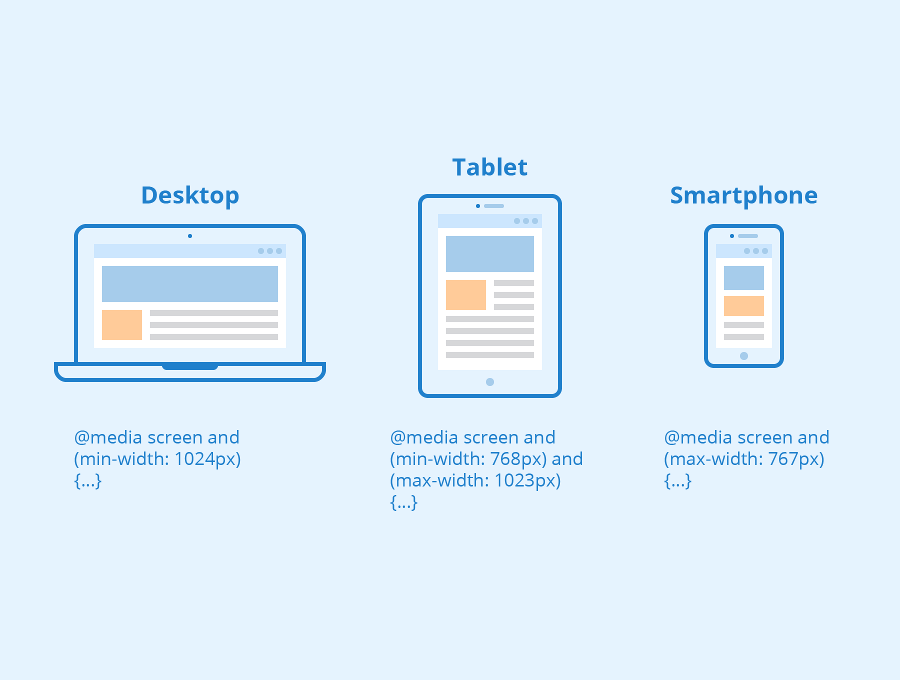 min-width: 600px; This property is used to give the minimum width from where the given styling should start applying. Only from this width the given styling will be applied.
@media (min-width: 768px) {
    .container{
    /* styles */
    }
}
max-width: 900px; This property is used to give the maximum width up to where the given styling should be applied. After crossing the range then the all of the styling mentioned in this query will be removed.
@media (max-width: 1180px) {
    .container{
    /* styles */
    }
}
We can use both the properties using the conditional operators to target the particular size. example is provided below.
@media (min-width: 768px) and (max-width: 768px)  {
    .container{
    /* styles */
    }
}
Apart from these we can also use height , width using conditional operators but it is not recommended.
Based on the device sizes we can set the specific CSS styling and can make the website fully responsive. Remember we can target any element using classes and id's and set the styling specific to the given device sizes.
Thanks for reading and if this blog got helpful to you then please like and share...


